The 2026 Shade Shifts Women Over 50 Should Welcome Into Their Closets
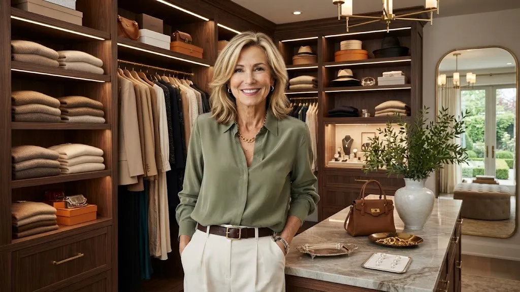
Color can feel intimidating when your wardrobe has gradually morphed into a reliable sanctuary filled with navy, black, beige, and dependable basics.
That doesn’t imply your personal style lacks imagination. It typically signals that you’re simply exhausted by guesswork. Certain vivid hues feel overly loud, specific pastels feel too saccharine, and numerous fads appear designed for individuals leading entirely different lifestyles.
The encouraging reality is that the palette shifts for 2026 prove far more accommodating than they initially appear. They never demand that women past fifty impersonate someone else entirely.
What Makes a 2026 Shade Worth Introducing
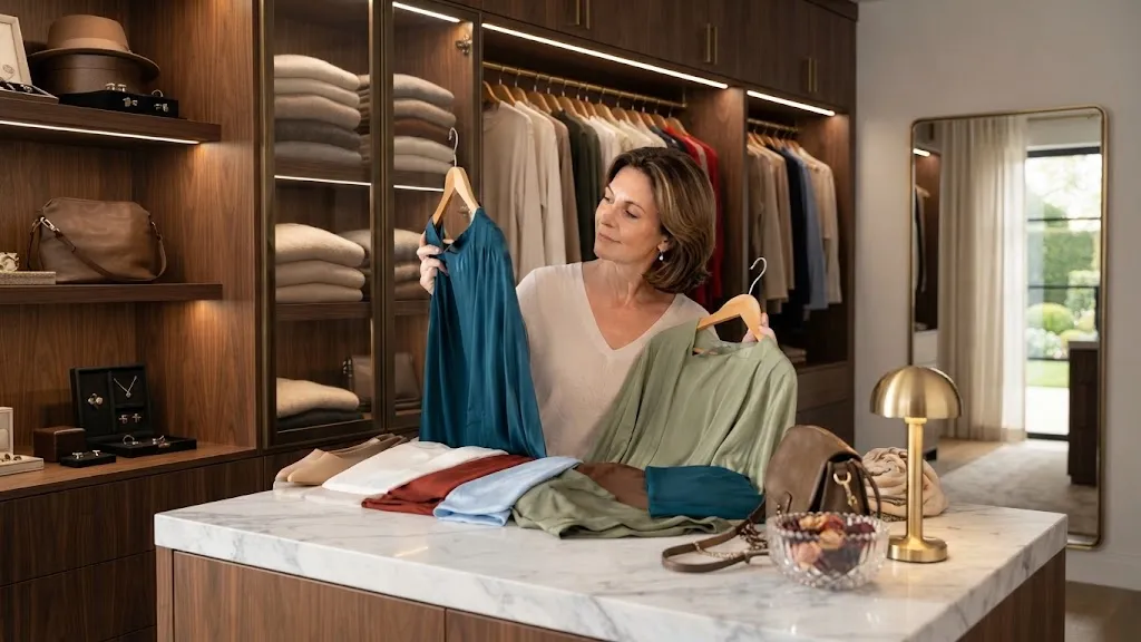
A specific tint only earns real estate in your closet if it genuinely serves your daily routine.
This means it ought to blend seamlessly with current garments, elevate the specific textile it arrives in, and multiply your outfit combinations instead of serving as a solitary specialty garment gathering dust.
Pantone selected Cloud Dancer, an understated pale neutral, as its defining hue for 2026, whilst their Spring/Summer fashion breakdown features variations like Alexandrite teal, Lava Falls red, White Onyx, and Sage Green.
Vogue UK also spotlighted mid-decade summer favorites including turquoise, sky blue, butter yellow, olive green, and tomato red.
That mix reveals a clear pattern.
This year isn’t just about loud color—it is about balance.
A great color should do one of three things:
- Freshen your neutrals
- Bring warmth back to your face
- Add a modern touch to simple clothes
Color note: The most practical trend shade isn’t always the most vibrant one. For example, bold red looks fantastic as a purse, pale yellow feels ideal in a cozy sweater, and vibrant blue stands out beautifully via accessories like scarves, earrings, or a lightweight linen button-down.
Embrace the New Neutrals Soft White, Cocoa, Sage, and Olive
The simplest gateway toward adopting modern tones isn’t diving headfirst into blinding primaries.
Begin instead with the updated neutrals.
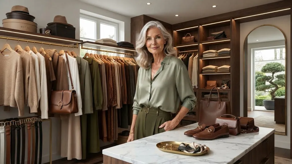
Soft white, rich cocoa, dusty sage, and earthy olive feel thoroughly contemporary without screaming for attention. They also excel within mature dressing because they diffuse stark contrasts rather than washing your features out.
An ivory cotton shirt looks far less aggressive than stark optic white. Cocoa brown delivers cozier undertones than flat black. Sage and olive inject organic color into your collection while remaining subdued enough for errands, midday lunch dates, travel days, and smart-casual weekends.
These tones are especially useful when you want everyday looks for women over 50 to feel refined rather than overdone.
Curated Color Trends & Styling Guide
Explore modern combinations and essential wardrobe pieces
Soft white
Cocoa brown
Sage green
Olive
Warm beige
These particular tones succeed because they successfully compress high visual contrast.
Such a shift creates a more forgiving frame around the face, particularly when heavy black feels too severe against mature skin. You certainly aren’t required to banish black from your clothing racks. Simply surround it with warmer partners.
Try this experiment:Pair black trousers with a soft white blouse and cocoa loafers instead of a black top and black shoes. This keeps the look neat while feeling much lighter and more modern.
Add Vibrant Accents Without Overwhelming Your Style
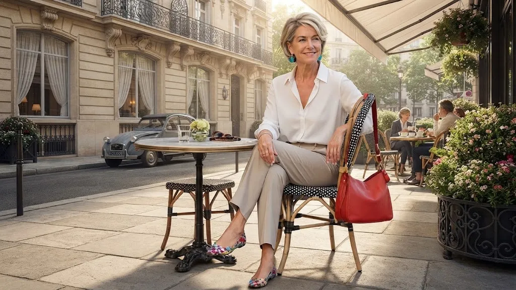
High-impact color is precisely where many style enthusiasts begin experiencing hesitation.
That reaction is entirely valid.
A complete head-to-toe tomato red gown or acid lime blazer might electrify a runway yet feel completely out of place at the local supermarket. Fortunately, color doesn’t need to hijack your entire aesthetic framework.
The wiser tactic involves treating electric shades strictly as targeted accents.
Tomato red, turquoise, punchy fuchsia, citrus yellow, and electric blue effortlessly modernize basic outfits when deployed in modest doses: footwear, statement drops, structured bags, silk scarves, belts, or a single tailored shell beneath a jacket.
This is where trendy outfits for women over 50 truly become wearable. The style trend is present, but you remain completely in control.
Proportion is the secret behind why this approach works.
When a bold color is used in a small dose, it reads as a deliberate styling choice. When it dominates your entire look, it can feel like a costume if you aren’t used to it.
Simple update: swapping in a red ballet flat or a low block heel instantly pulls together jeans and a white shirt without requiring a complete outfit overhaul.
Choose Fabrics That Elevate Trend Colors Instantly
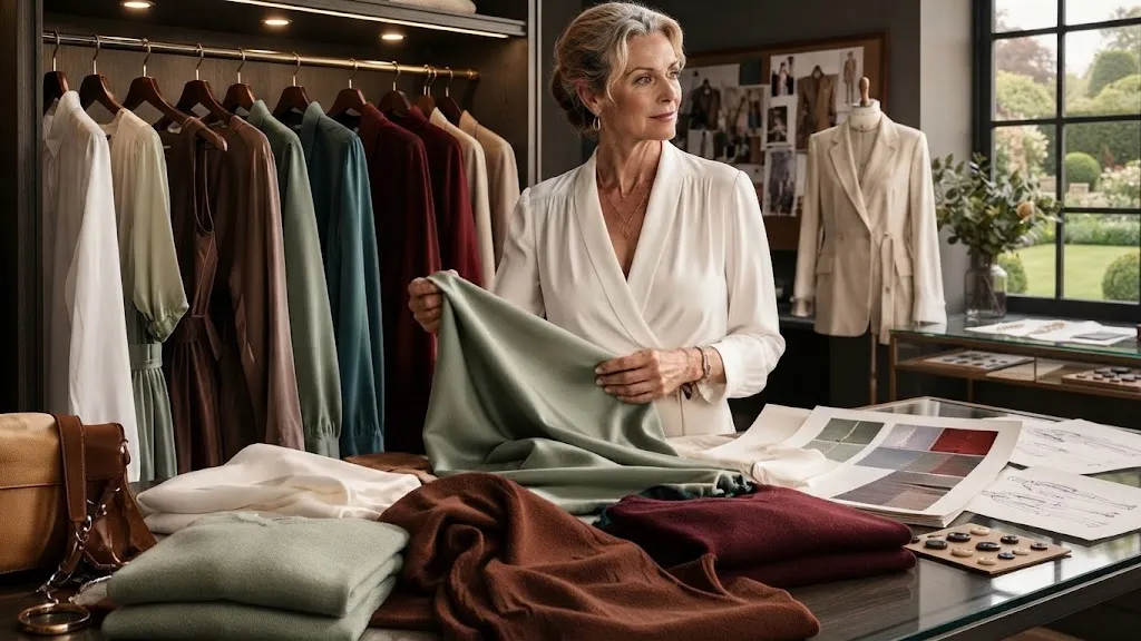
Pigment represents only half of the complete style equation.
Textile choice dictates whether that specific hue reads as expensive or cheap.
A vibrant tint rendered in thin, clingy synthetics can prove unforgiving. That exact same shade executed in structured linen, crisp cotton poplin, buttery suede, supple leather, fluid satin, or a dense fine-gauge knit immediately translates as mature and deliberate.
This explains why two individuals wearing identical shades can yield completely contrasting visual results.
The first appears impeccably tailored. The second feels as though the clothing is completely overshadowing her.
For the current season, pay meticulous attention to tactile surfaces. Soft white radiates elegance in heavyweight cotton, breathable linen, sturdy denim, and dense knits. Tomato red thrives within leather accessories, sharp shirting, or a smooth button-front cardigan. Sage reaches its peak visual interest whenever the underlying fabric possesses intrinsic structure, such as robust twill, smooth poplin, or a tailored utility jacket.
Fabric rule of thumb: high gloss amplifies color volume. Matte textures naturally quiet down vibrant pigments.
Consequently, if teal feels too loud in fluid satin, explore it via a structured cotton button-down. If crimson feels overly sharp in a sharp blazer, try it instead through a supple leather handbag.
This framework demonstrates how you customize fleeting trends to match your comfort threshold instead of dismissing them altogether.
Create a Repeatable Color Formula That Works Every Time
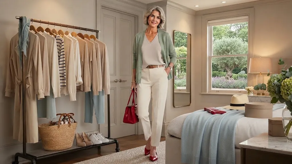
A high-functioning wardrobe requires zero endless combinations.
It simply demands a handful of trusted formulas.
Regarding color coordination, the most reliable formula is remarkably straightforward:
Formula:One soft color + one calm base + one small accent
This layout might translate to ivory denim, a dusty sage blouse, and scarlet flats. Alternatively, it could mean dark indigo denim, an ivory cotton tee, and a turquoise statement pendant.
Your neutral base provides grounding. The muted secondary color injects freshness. The minor accent delivers individual character.
Here are a few real-life outfit formulas that are simple to wear.
The beauty of this approach is that it requires zero shopping.
You likely already own the core foundation pieces. The only addition might be a scarf, shoe, top, or cardigan in a fresher hue.
Smart budget tip: before investing in a brand new dress in a trendy shade, test the color first with an affordable scarf or simple tee. Wear it twice. See how it feels in natural daylight, during dinner, and paired with your everyday makeup.
Wear the Right Colors in the Right Places
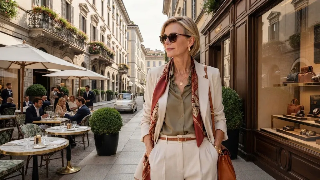
A color that feels great on holiday might feel out of place in a meeting. That does not mean the shade is bad—it just means the setting calls for a different approach.
For relaxed days, sky blue, soft white, olive, and butter yellow feel effortless. For dressier moments, teal, deep red, cocoa, and purple carry more presence. For travel, the best shades are those that hide minor wrinkles and pair easily with just two pairs of shoes.
This is where capsule wardrobe planning for women over 50 becomes so helpful. Instead of buying random shades, you select colors that work across your entire week.
- A soft white blazer pairs effortlessly over jeans, a dress, or black trousers.
- Cocoa loafers add warmth as a great alternative to standard black shoes.
- A teal blouse instantly elevates simple pants without needing heavy accessories.
Seasonal update: During warmer months, style soft white with sky blue and tan. In cooler weather, wear that same soft white with cocoa, olive, and deep red. That simple shift keeps your closet feeling current without requiring a total wardrobe reset.
Master Tricky Colors and Make Them Work For You
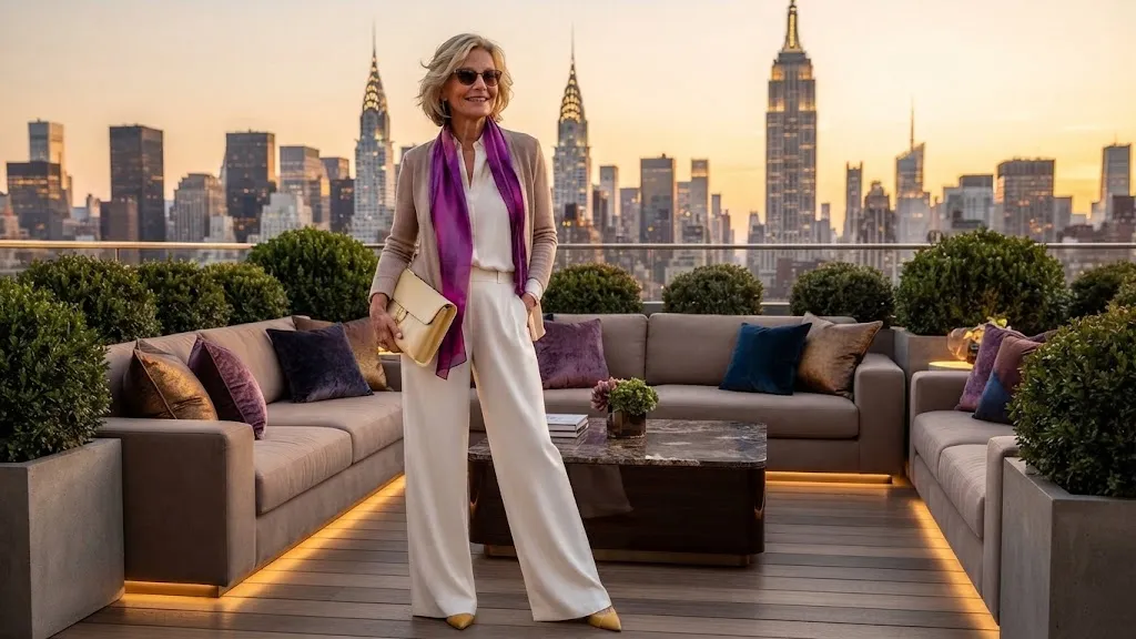
Certain seasonal hues demand thoughtful handling.
This realization certainly doesn’t categorize them as forbidden territory.
It simply dictates that they require proper textile selection, strategic body placement, or balanced color pairings.
Acid lime, vivid lemon yellow, and high-shine magenta carry immense visual weight instantly. If they genuinely excite you, incorporate them proudly. If they trigger hesitation, dial down their intensity.
Try lime as a subtle print motif rather than a solid statement top. Select butter yellow instead of neon yellow. Wear rich purple via suede footwear or a satin evening clutch rather than committing to a glossy, head-to-toe ensemble.
The ultimate objective is never avoiding color out of fear.
The mission is ensuring color actively works for you.
What to avoid: purchasing a trendy shade purely because it saturates every retail window. A legitimate color addition should brighten your facial features, simplify outfit assembly, or breathe new life into existing garments.
If it accomplishes none of these benchmarks, appreciate it from afar and walk away.
2026 Color & Wardrobe Master Guide
An interactive, high-end professional style guide designed to effortlessly integrate this year’s top tones into your wardrobe.
The 2026 Palette
Explore the harmonious blend of nature-inspired muted tones tailored for timeless elegance.
Wearing Brights
Make a sophisticated statement with confident color pops that illuminate your everyday style.
Polished Hues
Rich, grounded tones that add exquisite depth and seasonal warmth to your outfits.
Wardrobe Strategy
Practical golden rules to curate a seamless capsule closet with modern seasonal trends.
Avoid the Try-Hard Trap
Keep outfits simple and let one color do the work. A crisp white shirt, straight jeans, and red flats look vastly more modern and effortless than chasing five trends at once.
Frequently Asked Questions
Everything you need to know about navigating the 2026 color trends with absolute confidence.
Conclusion
Dressing in color after 50 isn’t about chasing every single trend.
It is simply about finding the shades that make your clothes feel alive again. A crisp soft white shirt, a cocoa shoe, a sage layer, or a pop of red can completely shift the mood of an outfit without changing who you are.