2026 Color Trends Women Over 50 Will Love
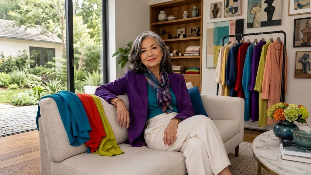
2026 color trends women over 50 will love start with a simple truth: store shades can look brighter and stranger than the neutrals you already love — but the right shade can still suit your life, your skin tone, and the clothes you already own.
That is what makes 2026 so interesting. The runways are full of bold blues, purples, reds, greens, and warm yellows — but there is still plenty of space for cream, navy, gray, and softer shades too.
The best outfits for women over 50 do not run after every trend. They use color wisely: shades that lift your face, mix with ease, and make your trusted basics feel fresh — without making you start your wardrobe from scratch.
2026 Is Brighter, but You Do Not Need a Bright Wardrobe
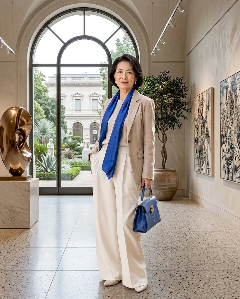
One of the biggest changes in 2026 fashion is that color is back in a big way. Spring showed lime, violet, scarlet, turquoise, yellow, fuchsia, and creamy whites, while fall carried it on with electric blue, royal purple, red, turquoise, peach, and burgundy.
That may sound bold on paper. But in real life, you do not need to wear a trend color from head to toe to look current.
A cobalt sweater with navy trousers can do the trick. So can a plum scarf over a gray coat, a turquoise blouse under a cream jacket, or red flats with jeans and a white shirt.
The real question is not which color is called “best” after 50. It is which version of the trend suits your skin tone, your wardrobe, your comfort, and your daily routine.
If bright chartreuse makes you feel uneasy, do not wear it near your face. Try it instead as mossy green trousers, a handbag, a print, or shoes.
If bright red feels amazing on you, there is no need to shrink it down to a small accessory. A red knit or dress can easily become part of your everyday style.
Here is a simple starting point to turn runway colors into outfits you can actually wear.
2026 Color Family — Easy Wardrobe Version
Start with the row closest to colors you already wear.
| Color Family | Easy Version | Pair It With |
|---|---|---|
| Electric and icy blues | Shirt, cardigan, scarf | Navy, charcoal, white, denim |
| Royal purple and plum | Knit, blouse, handbag | Cream, gray, chocolate, black |
| Red and peach | Sweater, jacket, flats | Denim, camel, white, navy |
| Chartreuse and moss | Scarf, shirt, trouser | Chocolate, cream, charcoal |
| Cream and soft white | Jacket, knit, trouser | Burgundy, navy, teal, tan |
Begin with the row that is closest to the colors you already wear. Adding just one nearby shade usually feels much more natural than building a whole outfit around a color you have never liked.
Blue Shades Make Old Basics Feel New
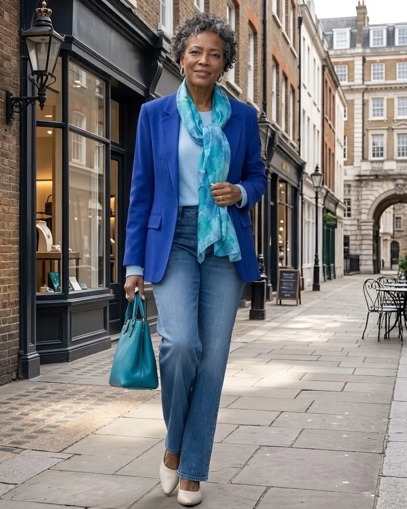
Blue is a great place to start because 2026 gives you many versions, not just one fixed shade. Icy blue stood out in spring, while electric blue and turquoise carried on into fall.
That range really helps. You can pick a soft blue if bold colors feel too much, or go for cobalt and turquoise if you like stronger contrast.
For a simple everyday outfit, try a pale blue button-front shirt with dark straight-leg jeans and loafers. The light color near your face softens the look, while the dark denim keeps it neat and pulled together.
Cobalt looks best when everything else stays calm. A cobalt crewneck with charcoal trousers, for example, creates a clear focal point without any extra styling effort.
Turquoise can look surprisingly elegant with deeper neutrals. Vogue’s fall 2026 coverage showed it moving past summer, even paired with olive and red on the runway.
For daily wear, you can keep it simple by pairing turquoise with navy, chocolate, cream, or dark denim.
Fabric tip: Bright blue often looks richer in matte fabrics like cotton, wool, linen blends, and soft knits. Shiny fabric makes bold color look more dramatic — lovely for evening, but less handy for a casual wardrobe.
Try this: Lay every blue piece you own out on the bed. You may already have the start of a 2026 color story without buying a single new thing.
Purple and Plum Are a Rich Choice Instead of Black

Purple is no longer just a short spring trend. Royal purple showed up again and again in the fall/winter 2026 collections, while deeper plum became another strong autumn favorite.
If you wear a lot of black, navy, brown, and gray, this is one of the easiest trend families to try. Purple has enough depth to sit nicely beside those neutrals without fading into them.
A plum cardigan over a cream top and charcoal trousers feels calm, yet far more interesting than another black layer. Royal purple with dark denim gives stronger contrast and can make a very simple outfit feel thoughtfully put together.
If rich purple feels too strong near your face, wear it lower down instead. Try trousers, a midi skirt, loafers, a belt, or a structured handbag.
Plum is especially handy in a capsule wardrobe because it can act almost like a neutral. It pairs well with cream, chocolate, gray, navy, black, and many shades of denim.
Color tip: Do not stress about finding the exact runway shade. Aubergine, blackberry, wine-purple, plum, and amethyst can all give the same fresh feeling — while letting you choose the depth that suits you best.
That kind of freedom is what makes trends helpful instead of limiting.
Red, Butter Yellow, and Peach Add Gentle Warmth
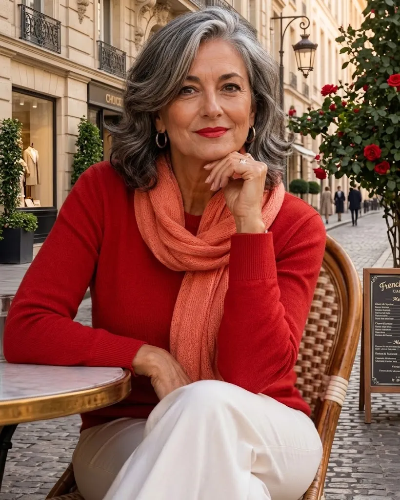
Some of the most eye-catching 2026 shades are on the warm side of the color wheel. Bold red has stayed visible all year, while butter yellow and peach offer softer ways to add warmth to an outfit.
Red works so well because even a little of it stands out. A red cardigan over a white T-shirt and jeans can make your everyday basics look sharper with almost no extra effort.
Butter yellow is different. In its palest form, it can almost act like cream — which is why Vogue called it one of the easiest yellow shades to pair with neutrals.
Peach sits between pink and orange, so its effect depends on the piece. A soft peach blouse looks gentle beside camel or ivory, while a bolder melon scarf can liven up navy or chocolate.
The key is to choose how much warmth you enjoy, rather than thinking you must copy the runway version exactly.
A few small tweaks can keep these brighter shades looking neat and polished, instead of too busy.
There is also no rule that warm shades must look soft or delicate. A tomato-red blazer with a white tee and dark jeans can look sharp and modern, not romantic at all.
That freedom is what good dressing over 50 is all about. Trends should give you more choices, not more rules.
Green Gets a Fresh Look in 2026
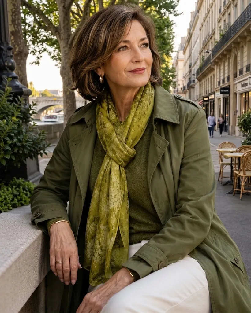
Green is one of the most interesting color stories this year because its versions sit at opposite ends of the comfort scale. Spring brought bright lime and chartreuse, while autumn moved toward softer moss and olive beside other bolder shades.
If you like strong color, chartreuse can be a surprisingly good accent. A chartreuse scarf with charcoal outerwear, or a bright green knit with dark trousers, needs very little else to work.
If that feels too sharp, there is no need to force it. Moss and olive give a similar but calmer effect, and they often mix easily with pieces already in a mature capsule wardrobe.
Olive trousers with a cream knit make a relaxed base for errands or travel days. Add loafers, sneakers, or ankle boots, depending on how polished you want the outfit to feel.
A moss jacket can also take the place of the usual black or tan layer. Because the shade has natural, earthy depth, it works with denim, chocolate, cream, burgundy, soft pink, and several blues.
Comfort tip: If you usually live in neutrals, bring green in through a relaxed cardigan, soft scarf, or casual jacket — not a tight statement piece. You will notice the color first, before you even notice the garment.
This is a perfect example of how trendy outfits for women over 50 can still feel practical. The freshness comes from color, while the shapes stay familiar.
Soft Neutrals Keep Bright Colors in Balance
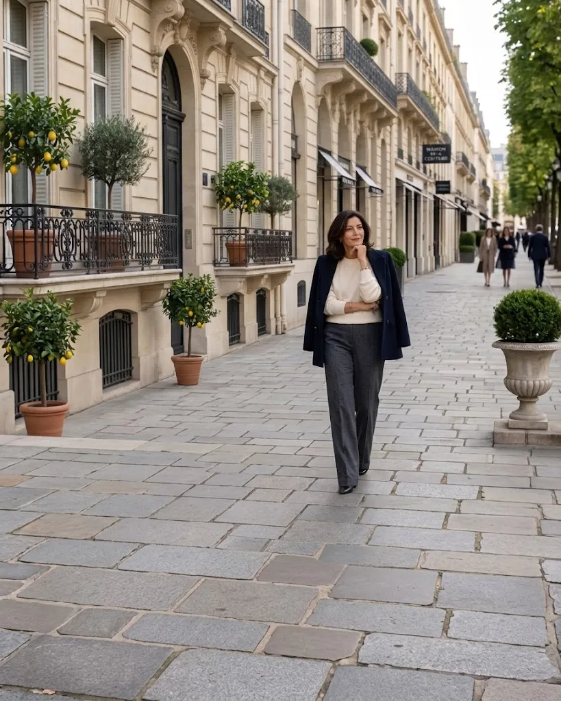
Not every important 2026 color is loud. Pantone’s autumn/winter report described a season that balances bold shades with calmer, earthier colors, while runway coverage has pointed to midnight tones, carbon gray, and creamy whites.
Spring also gave soft white a big role through Pantone’s 2026 Color of the Year, Cloud Dancer — a gentle off-white that appeared right beside much brighter runway colors.
These quieter shades matter because they make the bolder colors much easier to wear.
Midnight navy can take black’s place under cobalt, red, turquoise, or plum. Carbon gray gives yellow and purple a more settled base, without the harsher contrast of black.
Cream is especially helpful around the face. A cream blouse, knit, blazer, or scarf can soften burgundy, moss, teal, royal purple, and bright blue.
Texture is what makes these neutrals interesting. Think ribbed cream knitwear, brushed gray wool, navy denim, matte satin, linen blends, suede, or softly structured cotton.
A quiet color does not have to mean a forgettable outfit. Good fabric, clean shapes, and one stronger shade usually make far more impact than covering yourself in several competing trends.
Make Your Own 2026 Color Formula From a Shade You Love
The easiest way to use trend colors is to turn them into your own simple formula. Start with a neutral base you trust, add one current shade, then finish with a shoe or layer that matches the base instead of fighting the color.
Formula: trusted neutral + 2026 color + simple finishing piece.
For example, dark jeans + turquoise shirt + tan loafers works because the jeans and shoes make a familiar frame. The shirt brings all the freshness.
The same logic works for casual, smart casual, work, and evening outfits alike.
Your 2026 Color Formula — By Occasion
Trusted neutral + 2026 color + simple finishing piece.
Errands
Dark jeans + butter-yellow knit + white sneakers
Why: Soft color freshens a familiar casual base
Lunch
Cream trousers + plum blouse + tan loafers
Why: Plum adds depth while cream keeps the outfit light
Work or Meeting
Charcoal trousers + cobalt shirt + navy blazer
Why: Related dark neutrals calm the stronger blue
Travel Day
Olive trousers + cream knit + turquoise scarf
Why: Comfortable basics gain color without extra layers
Dinner
Black trousers + red blouse + simple metallic jewelry
Why: One strong color provides enough evening impact
Once you find a combination that feels right, repeat it. Change the blouse, swap the shoes, roll the sleeve, add a scarf, or trade trousers for jeans.
A reliable formula is far more useful than constantly hunting for new outfits. It cuts down decision fatigue while still leaving plenty of room for style confidence over 50.
Before you buy another trend piece, ask yourself one simple question: Can I wear this color with at least three things I already own?
If the answer is yes, it stands a much better chance of getting worn often — and giving you great value for money.
FAQs
Which colors are in style for 2026?
Big 2026 directions include electric and icy blues, turquoise, royal purple, plum, bright red, butter yellow, peach, chartreuse, olive, cream, midnight navy, and deep gray. Spring leans brighter, while autumn adds richer, darker versions. You do not need every shade — pick the few that work naturally beside your current neutrals.
What are the easiest 2026 colors to pair with neutrals?
Blue, plum, burgundy, olive, and butter yellow are good first picks because they blend easily with common neutrals. Navy, gray, cream, denim, camel, chocolate, and black can keep each shade settled. If you usually wear very little color, start with a knit, blouse, scarf, bag, or shoe rather than changing your whole outfit.
Can women over 50 wear bright colors?
Yes. Age does not decide how much color you may wear. The better questions are how the shade works with your coloring, how comfy you feel in it, and how well it fits your current wardrobe. Bright cobalt, red, purple, turquoise, or chartreuse can all look neat when the rest of the outfit has clear shapes and a calm palette.
How do I know if a trendy color suits me?
Hold the color near your face in natural daylight and look at your whole appearance instead of focusing on rules about undertones. If you look brighter and more defined, it may be a good near-the-face color. If you love the shade but dislike it beside your face, wear it farther away through trousers, skirts, shoes, bags, belts, or accessories.
How many trend colors should I add to my capsule wardrobe?
There is no set number. One or two colors that mix with several of your current pieces will usually beat six shades that each need their own outfit. Think in terms of repeat wear: a plum cardigan worn with cream, denim, gray, and brown earns its place much faster than a dramatic piece you can style only once.